
Colour-Coded Beauty: How Bold Packaging Colours Revolutionise Skincare
Welcome to the world of colour-coded beauty, where skincare and beauty brands are embracing the power of bold colours to revolutionise their packaging. This isn’t just about looking pretty on your vanity; it's a clever strategy that makes choosing your favourite products easier and more intuitive. Let’s dive into how some innovative brands are making waves with this trend.
The Psychology of Colour in Beauty Packaging
Before we delve into specific brands, let's understand why colour is so critical in packaging. Colour influences perception. A bright, bold colour can evoke feelings of excitement and happiness, while softer tones might suggest gentleness or calmness. This psychological impact is what brands like hideAWAY and others leverage to communicate the essence of their products.
hideAWAY’s Colourful Approach
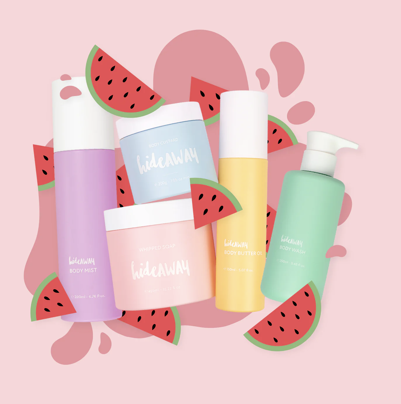
Take hideAWAY, for instance. This brand has smartly assigned specific colours to different product lines. For example, all their body custards come in blue packaging, while the whipped soaps are adorned in pink. This not only makes the product selection process straightforward for consumers but also creates a visually appealing product range. The specific flavour or variant is then identified with a sticker, which adds to the convenience without disrupting the colour scheme.
The Kmart Untitled Brand’s Unified Colour Strategy
Then there's the intriguing approach by the untitled Kmart brand linked here. This brand utilises a consistent colour for all products addressing a particular skin issue. This method simplifies the shopping experience, especially for consumers who are loyal to a specific product line for their skincare concerns.

Other Brands Following Suit
Several other brands are catching on to this trend. For instance, The Ordinary is well-known for its minimalist, clinical-looking packaging, but they use subtle color differences to distinguish between their product ranges. Similarly, Drunk Elephant uses a spectrum of colours, where each hue corresponds to a particular skin benefit or ingredient focus.
The Benefits of Colour-Coded Packaging
Easy Identification: The primary advantage is the ease of identifying products. Customers can quickly spot their preferred product line by colour, saving time and simplifying their shopping experience.
Brand Recognition: Consistent use of colour enhances brand recognition. When a brand consistently uses a particular colour for its packaging, it becomes synonymous with the brand itself.
Aesthetic Appeal: There’s no denying the visual appeal of a colour-coordinated skincare collection. It's not just about functionality; these brands are also tapping into the desire for aesthetically pleasing products.
Targeted Marketing: By using specific colours for certain product lines, brands can target their marketing more effectively. For example, using green for natural or organic lines can instantly communicate the product's essence to environmentally conscious consumers.
Emotional Connection: Colours evoke emotions. A calming lavender shade might be perfect for relaxation-focused products, while a vibrant orange can convey energy and vitality.
The Future of Colour in Skincare Packaging
The trend of using bold colours in skincare and beauty packaging is likely to evolve as brands become more experimental and consumers more discerning. We might see more personalised colour schemes, limited edition colours, and even colour-changing packaging as technology advances.
Conclusion
The use of bold colours in skincare and beauty packaging is more than a mere design choice; it's a strategic move that enhances user experience, boosts brand identity, and creates an emotional connection with consumers. As we continue to see this trend grow, it will be exciting to witness how brands innovate and push the boundaries of packaging design.
Remember, the next time you’re browsing for skincare or beauty products, take a moment to appreciate the colour-coded world of beauty – it's not just pleasing to the eye but a clever tool in navigating the vast world of skincare.
Cant get enough colour in your life? Download our free colour book here.